 |
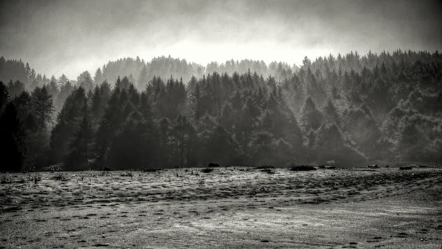
| Foggy Trees |
Week 9 almost had me diving into my archive to satisfy one group, and a last minute shot for the other. For
+Weekly Photo Project 2013 weather and timing weren't working in my favor four our landscape theme. I was never out shooting at the same time the sun was out. I was thinking I'd need to go into my archive to find something when I happened across this. I had accidentally shot this in auto-bracket mode, giving me 7 exposures, so I jokingly played with HDRing it thinking nothing would come of it. The exposures were really flat to begin with, but when it came out of the HDRing there was more depth to the trees there. As the day was very monochromatic, and HDR didn't help with the color, I decided to just ditch all semblance of color in Topaz Labs B&W Effects 2. I started off in their Platinum Collection, which makes use of quad-toning, added some grain to disguise my poor noise reduction technique (or lack thereof) and added a vignette to it. I find the shot to be very dramatic, maybe too dramatic. If I die and were to become a famous photographer I would hope this would be the only piece to be in my "emo period".
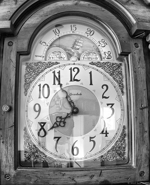 |
| Grandfather clock |
For the
+Project 52 B&W our theme was hands. I don't have interesting hands. I don't know anyone with interesting hands or contrasty colored nails. And I don't think I could walk up to some stranger who has tattooed hands and as to take a shot of them. So for 6 out of 7 days I ignored this thinking something would pop up or if worse came to worse take a shot of my own hands. Then I saw this in my dining room, an old, sadly not working, grandfather clock with some pretty ornate hands. This was an HDR shot also. The reflection on the clock face glass was kind of annoying me, especially when I was shooting it handheld and seeing myself in it. A tripod and remote shutter helped.
You can view my Weekly Photo Project album here.
My black & white project album here.


Comments
Post a Comment