Posts

Showing posts with the label bay bridge

Running... Again?

Image
  If you know me you know there was a time about 10 years ago or so where I was running. A lot. At least 5 days a week and at least 5 miles a run. I wasn’t training, I wasn’t preparing for a race or a marathon. I just found myself enjoying the time spent running. I wasn’t obsessed with numbers, but I kept track of them all and liked seeing improvements in time and distances. It was good physical health and mental health. Then I tweaked my knee. Not bad enough that I couldn’t walk on it, just a tweak that told me I needed to back off of running for a little bit. So I decided on 2 weeks. At the end of 2 weeks I aborted a run very early as the pain was still there. 2 weeks became 3, became a month, became 5 years. 

Blue Bay Bridge

Image
The Bay Bridge I was looking through my blog posts and noticed that there has been a lot  of black and white or monochrome postings. Between my black and white project, and the ABC project you have to go pretty far back to find something with vivid colors. I had a shot that I was originally going to use for today but it was basically monochrome so I'll share that one later. So then I got started working on this shot. I don't know why I thought this would end up being a vivid colorful image, because it certainly wasn't when I started it. I did, as you can obviously see, bring out some blue in the water. Probably too much, but I flip flop between too much and just a little too much. The exposure was an 8 second long exposure so I liked what it did to the water, this soft dreamy look to it. As far as processing the heavy work was done in Clarity  which has been my favorite tool to work with for just about any photo. Using the clarity sliders I was able to make the clouds p...

Gotham Bay Bridge

Image
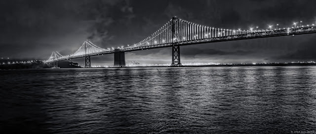
Bay Bridge Pano B&W Going through my Aperture library with an eye to finishing panoramas I ran across this four shot Bay Bridge shot. The photo came out pretty good in color, but there were some definite issues with it the background. I liked it well enough while shown at a size less than 100%, but when viewed at 100% there were some problems that I couldn't fix. I quickly took it into Black & White Effects and used their Cool Tone and got this. I instantly liked it. It still doesn't look great at 100%, but I'm happy enough with it.

Popular posts from this blog

Running... Again?

The Pros and (Mostly) Cons of Upgrading to a 4K Monitor